Case study: Tila
Tila (2022)
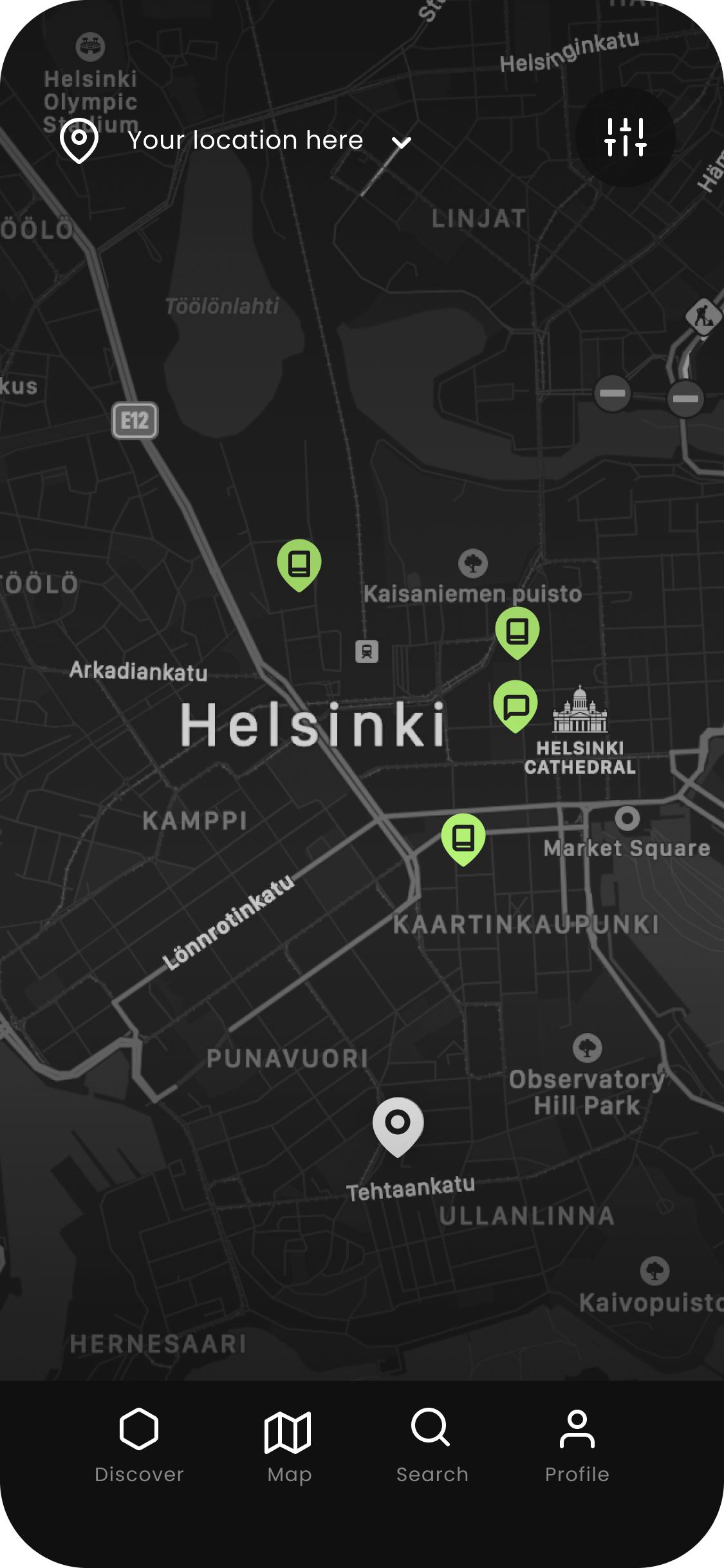
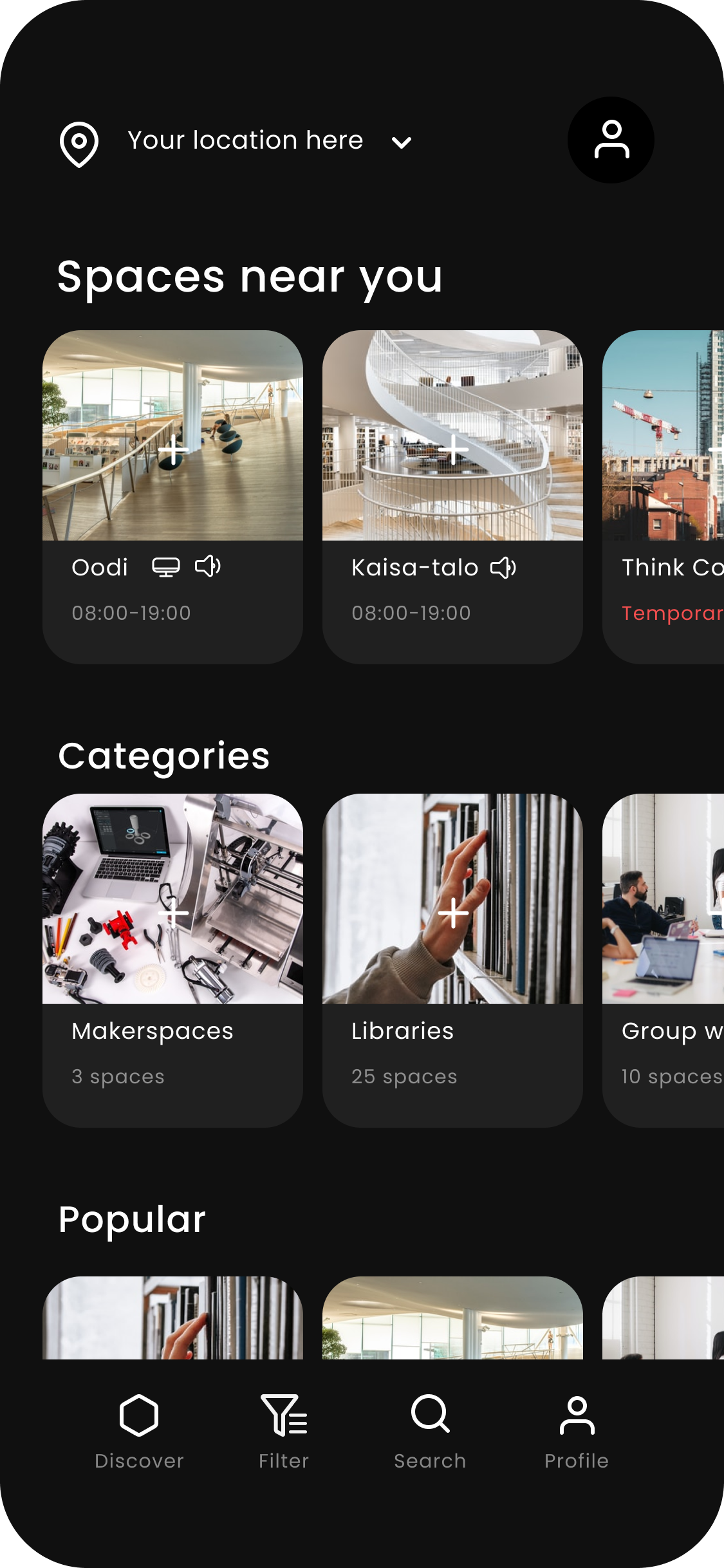
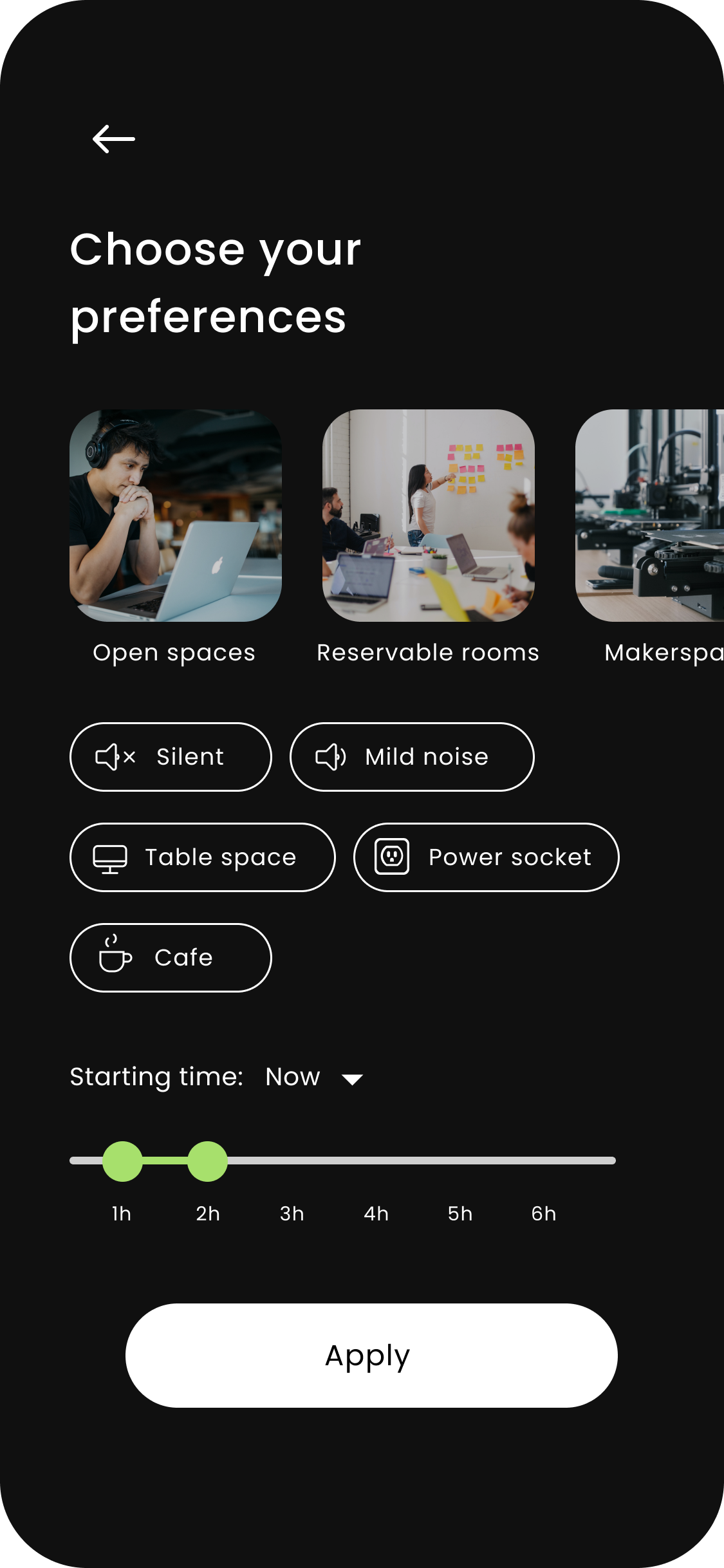
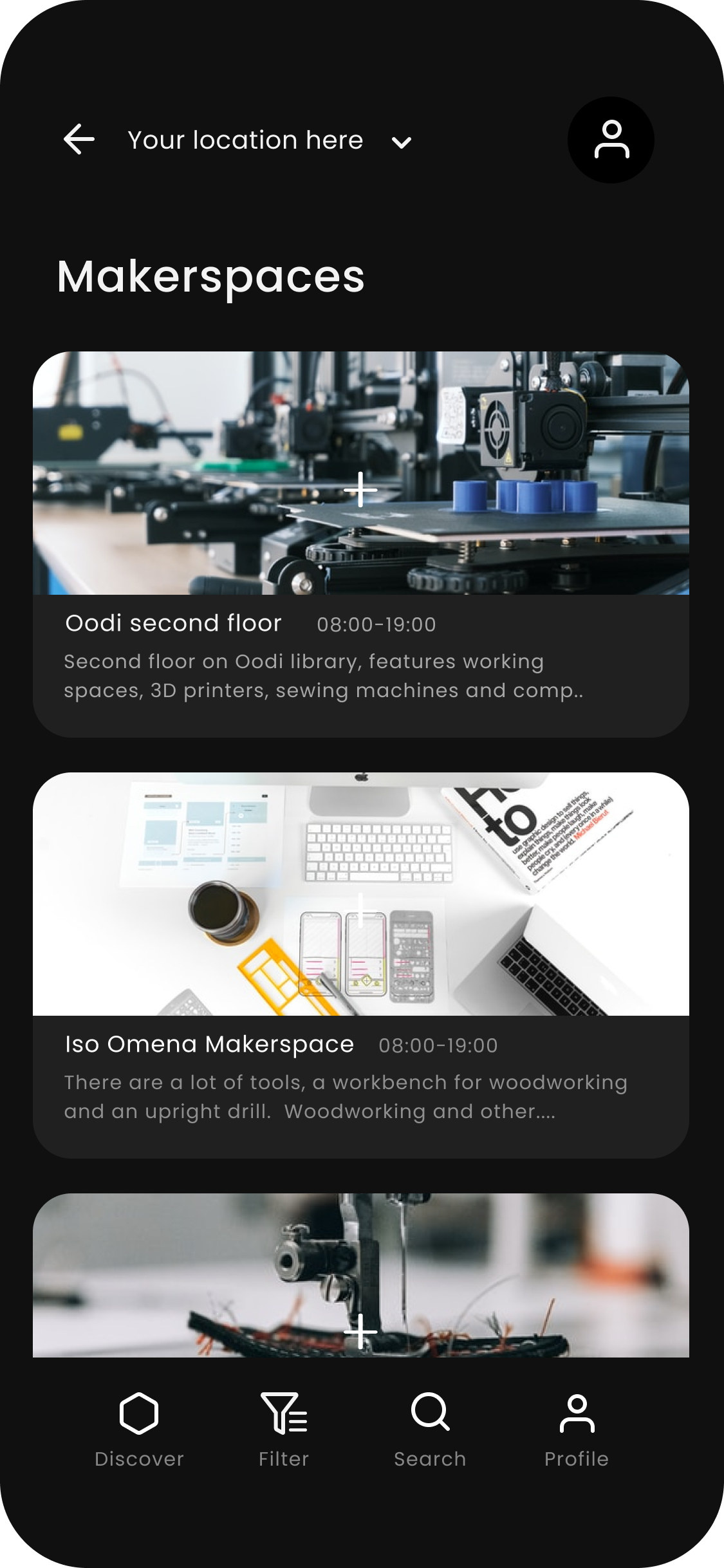
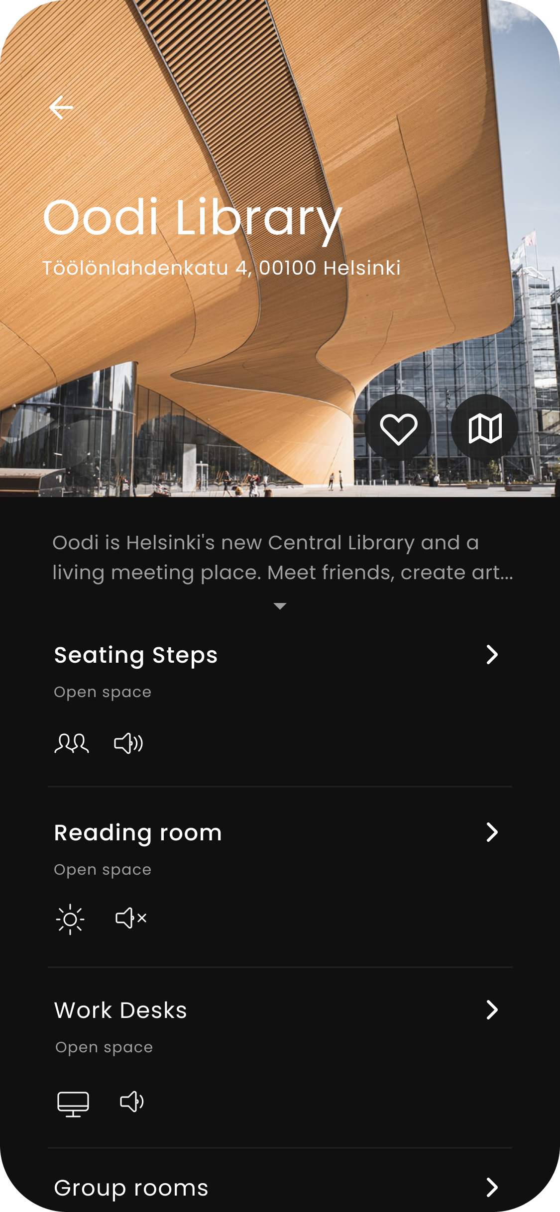
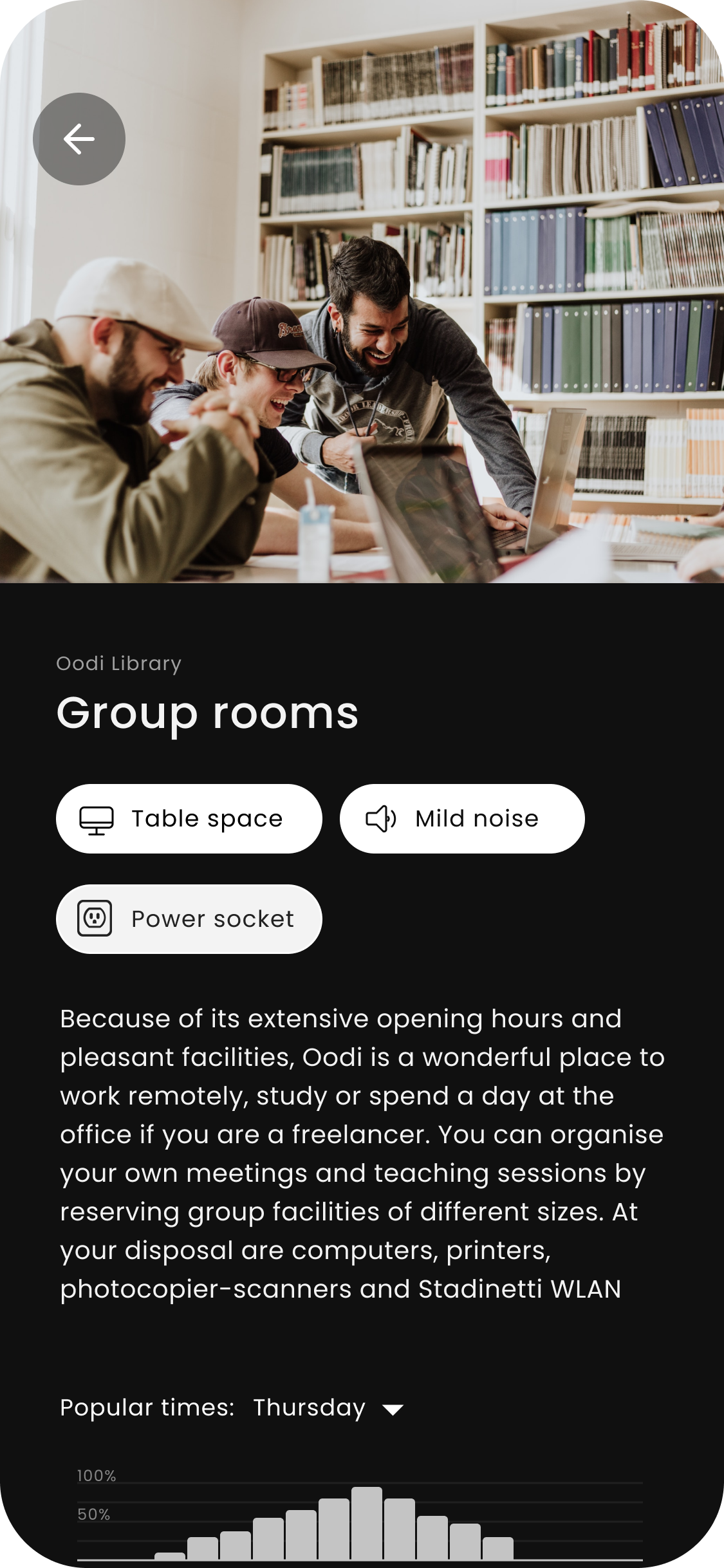
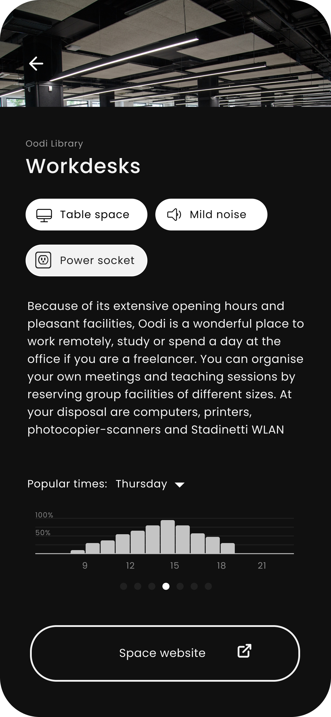
Tila is an application concept for finding workspaces sparked by the emerging trend of increased remote working. Tila was designed during Aalto University’s Interaction design course as group work. The project featured user research, a Google design sprint, AB user testing, and prototyping of the application. My areas of responsibility on the project were research, user testing, brainstorming and ideation, concept work, and the design of the mockups and the UI/UX (with Sera).
Project members:
Anna Vienamo
Jiawei Qi
Otto Loikkanen
Sera Remes
Anna Vienamo
Jiawei Qi
Otto Loikkanen
Sera Remes
User research
Our process started with observing people in public spaces based on a brief. At this point, we did not yet know what direction the project would take. Instead, we focused on mapping how people behave in spaces based on the f-formations theory. The space we chose for observation was Oodi Library in Helsinki. We used videotaping to later go through the data to analyze what problems people were having in the space. Based on the gathered data we spent the second week brainstorming and forming possible solutions to the problems we found using the Google design sprint formula.
Still image taken from one of the user observation videos
Design sprint & prototyping
Based on our fieldwork and user research, we conducted a one-week-long design sprint using the strategy described in the Google design sprint. During this week we brainstormed our solution idea and everything to do with the raw concept. Since our group worked remotely we chose to work with digital solutions, therefore deciding to design an application. Based on the data from our user research videos and our brainstorming we created a crude mockup for our first round of user testing, to find out if people would even be interested in our concept. Since I and Sera already had a lot of experience with Figma, we were able to craft a decent-fidelity test model very rapidly. Therefore our prototype already had some graphical elements and provided an illusion of being a working application instead of driving the user test with a crude wireframe prototype.
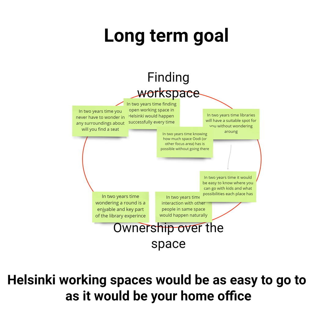
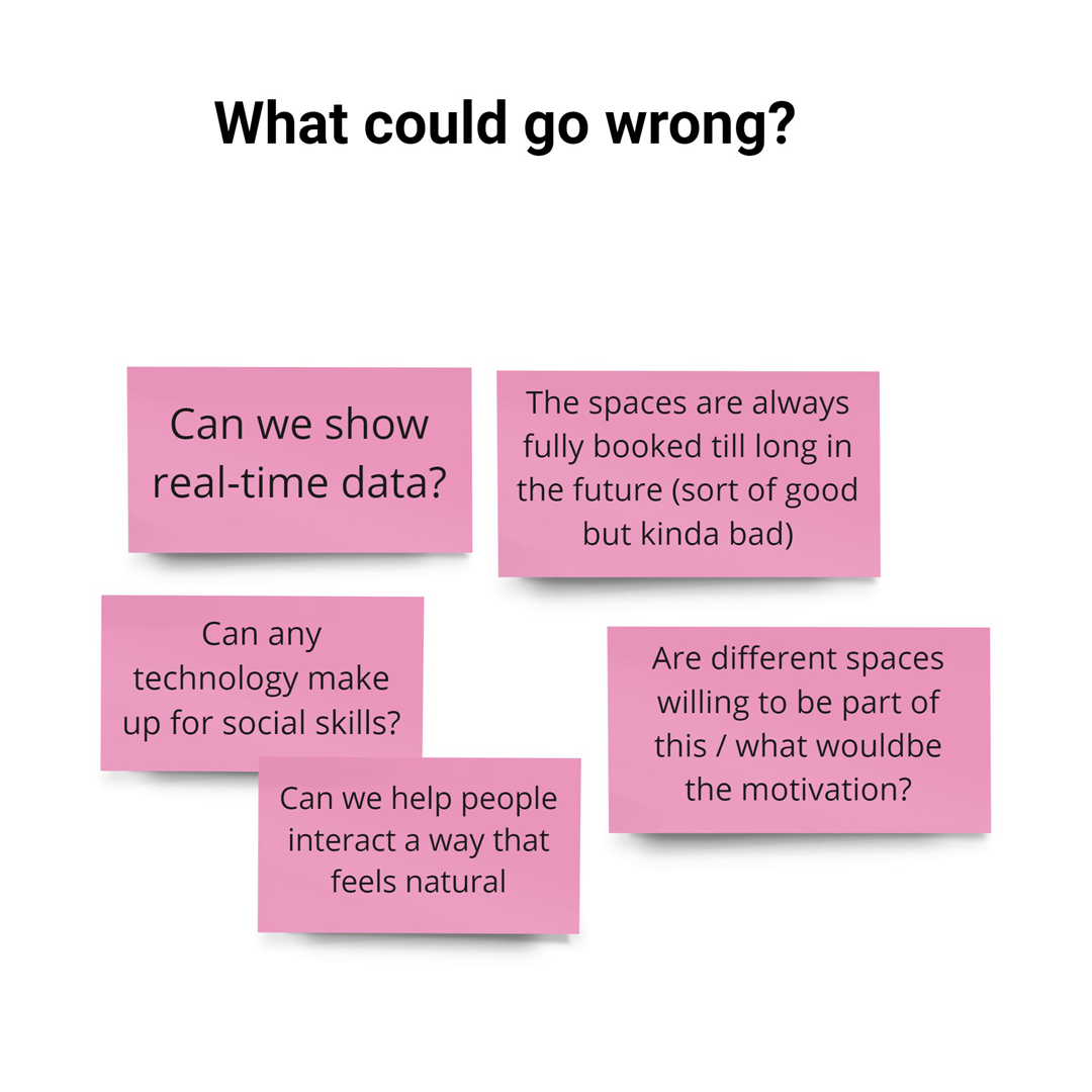
Below there are some examples of our extensive post-it brainstorming and group working done in Miro.
The result of the first weeks design sprint was a rough prototype mockup for user testing
User testing & AB testing
We tested our first mockup on five users consisting of university students. Based on the feedback we found out that people were somewhat enthusiastic towards our main concept, but did not show any interest in certain features such as our plan to implement a social feature. Based on the user feedback we dropped unnecessary features and focused on the most important features in our application.
We continued to develop the first version based on the feedback, but also decided to make a version B to test if our application was functioning optimally. To challenge our first map-based version we created a "scroll and choose" version which was thought to be more familiar to people coming from other applications. We recruited five new test users and drove the second round of user testing on these two more refined prototypes, and found out that option B was somewhat preferred by the test users, but most preferred having both options (the map and the scroll and choose) for searching spaces. Based on this user feedback we combined these two flows while perfecting the application as a whole.
A and B user testing prototypes
Final prototype
Based on the feedback from our multiple rounds of user testing and research, we combined the two flows into a final version and made a presentable interactive version of the prototype to be displayed at our final critique. This case study is a simplified version of the process for a quick read. Contact me on my socials if you are interested in hearing more about the project.
